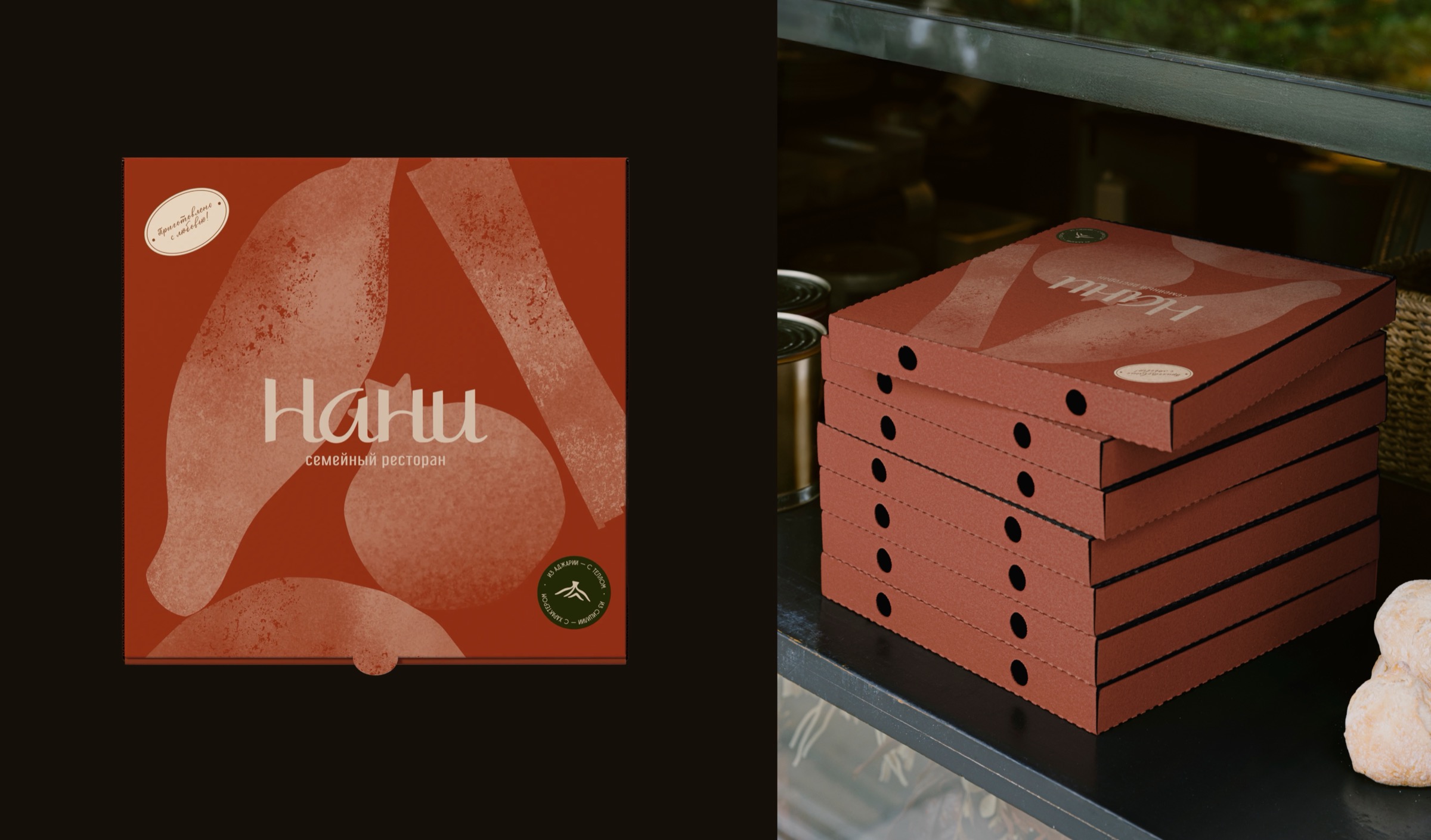
Nani
About
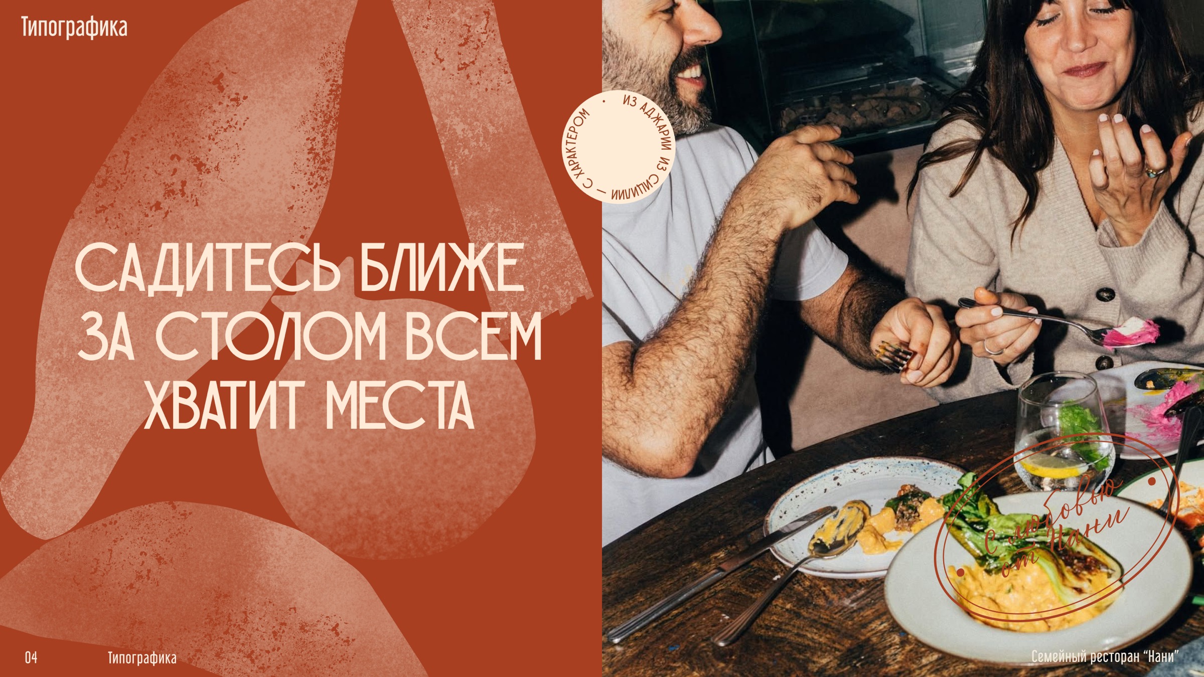
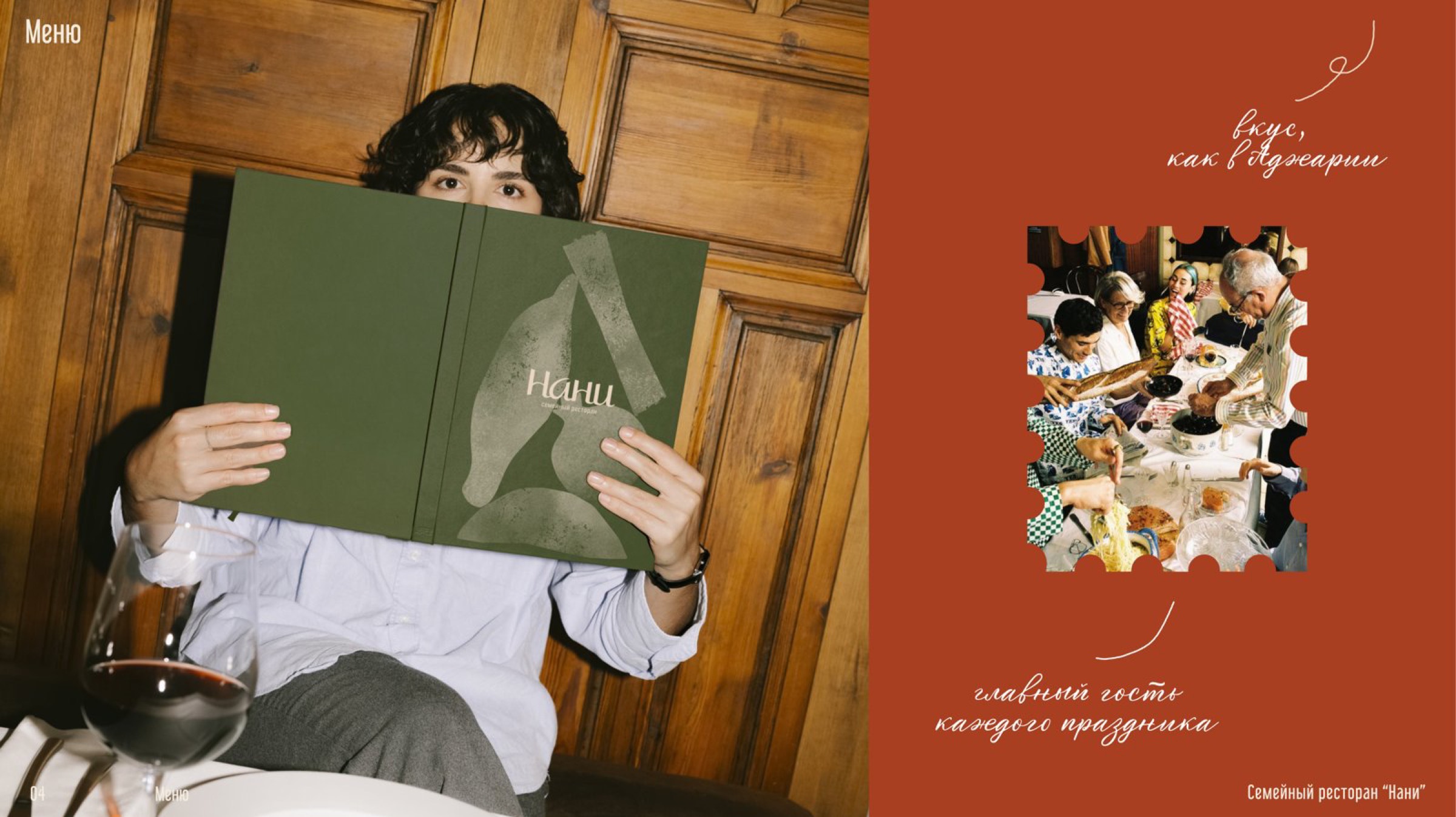
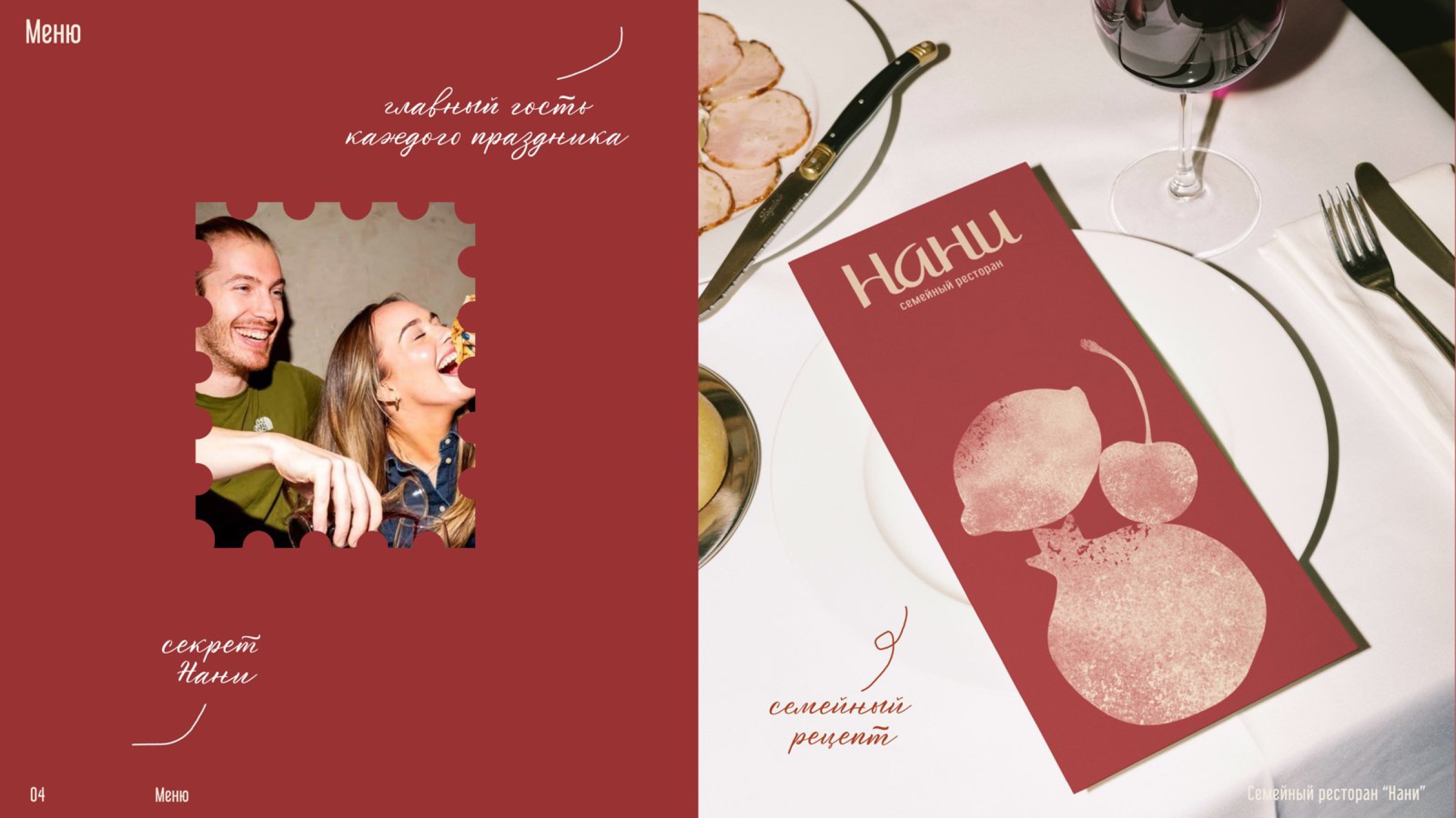
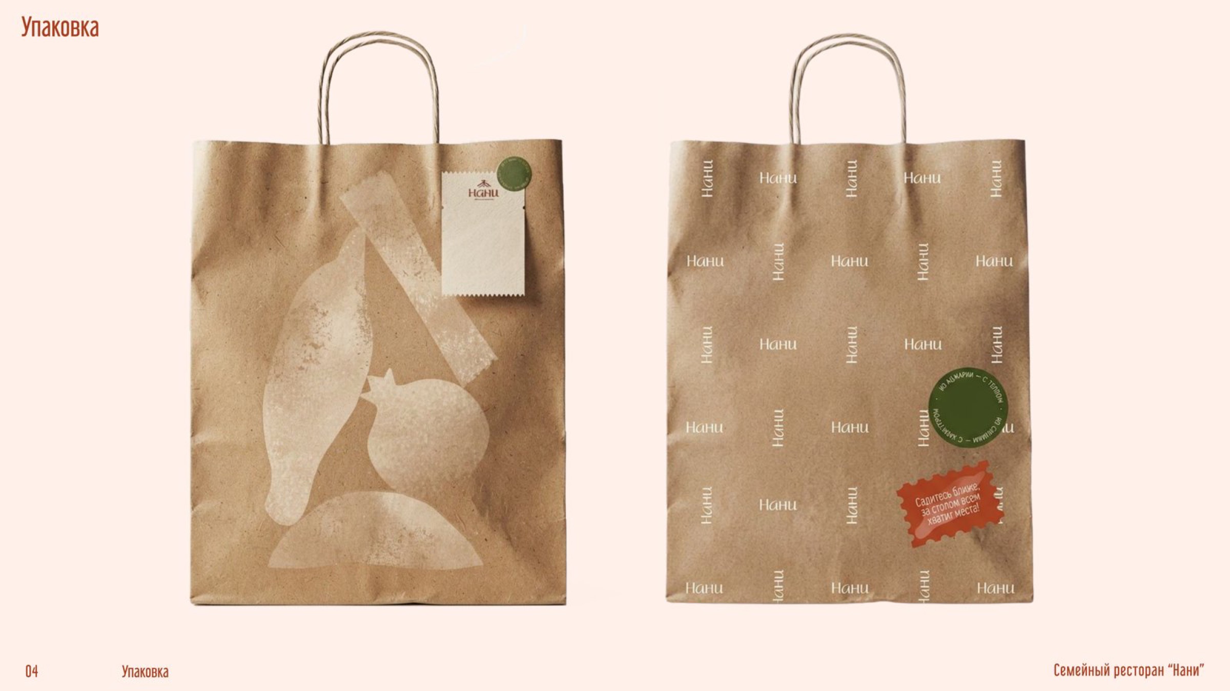
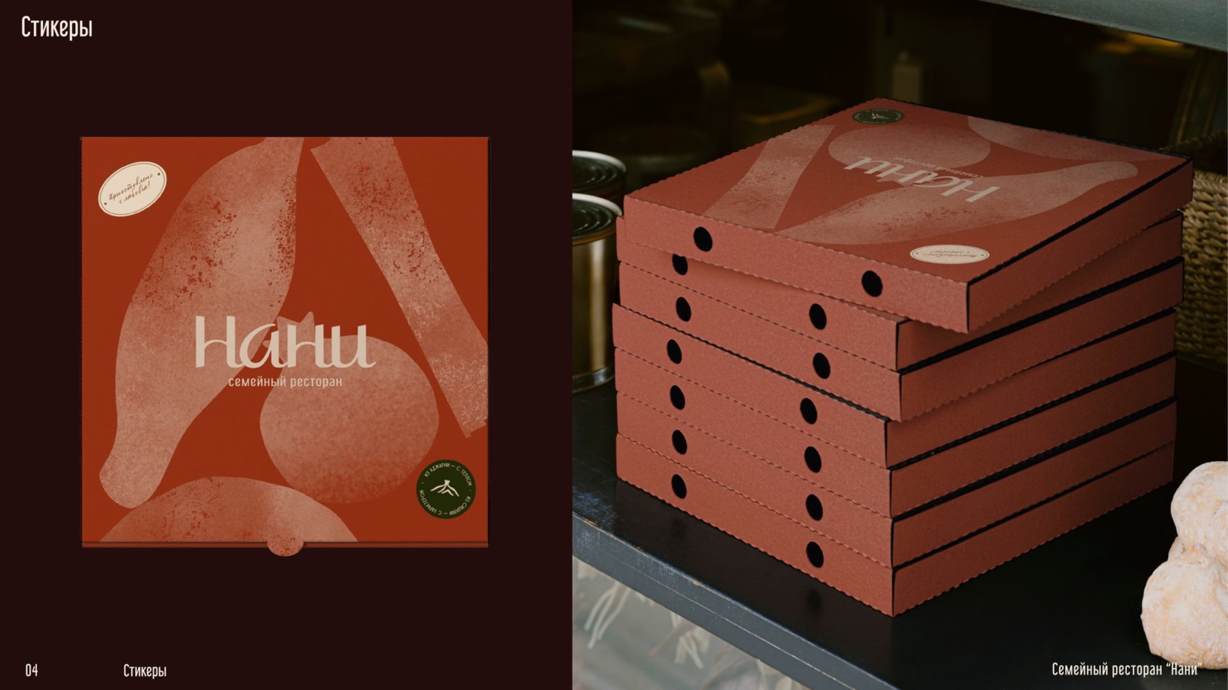
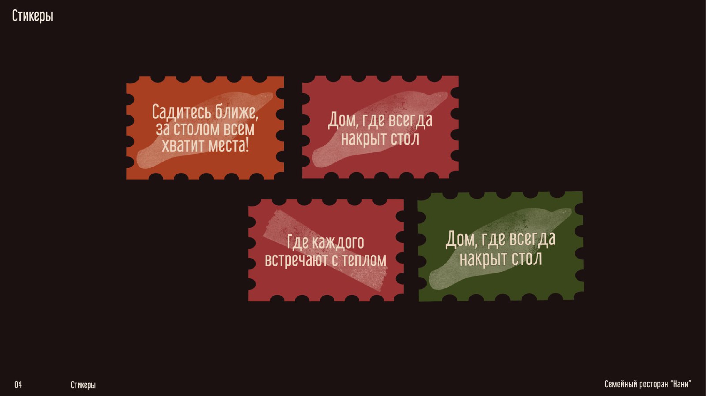
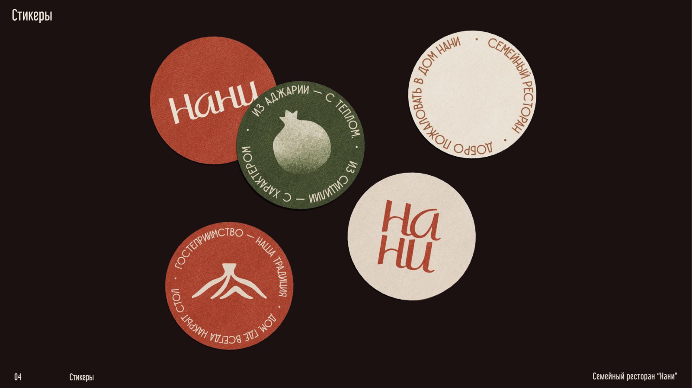
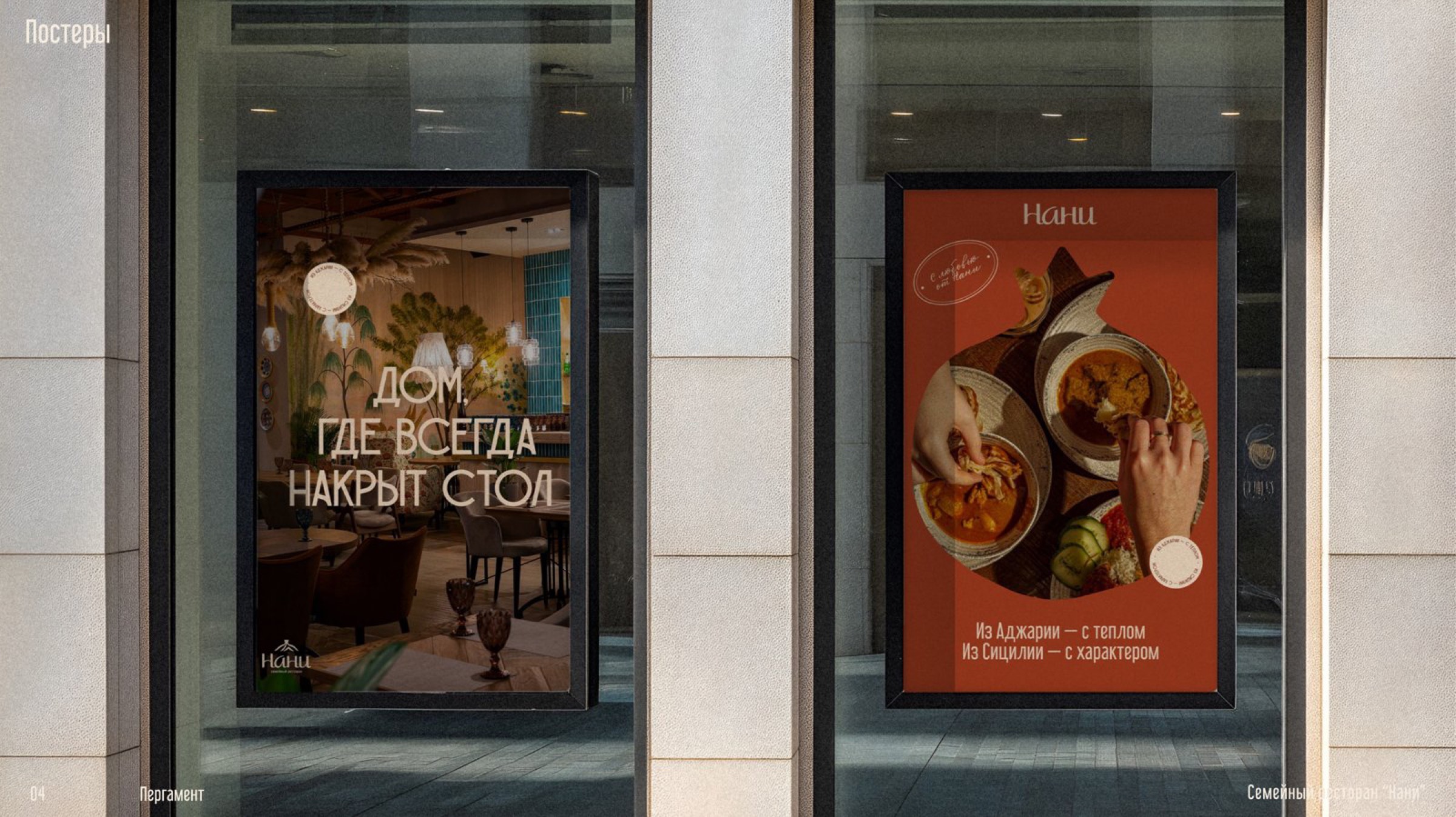
A brand redesign for Nani, a family Georgian restaurant, built to attract a more upscale audience, gain real traction on social media, and give the restaurant a clearer, more strategic visual identity.
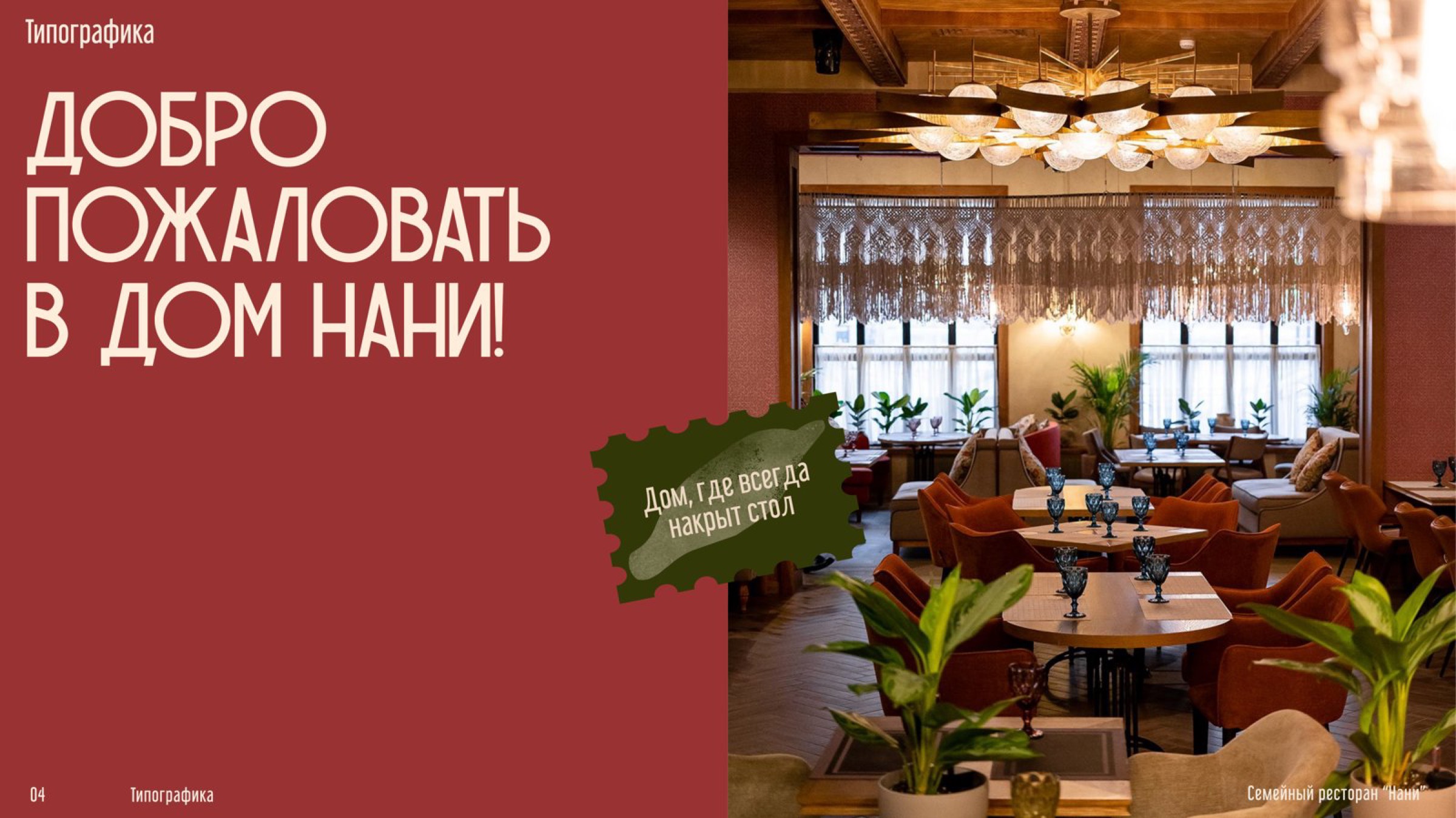
Challenge
Nani's existing identity wasn't pulling in the crowd the restaurant wanted — the look and feel skewed too casual to draw a more middle-to-upper-class clientele, and it wasn't getting much attention on social media. On top of that, the visual system itself lacked a clear strategy: nothing about the identity communicated what the restaurant stood for at a glance. The redesign needed to solve all three at once — a more upscale feel, more social pull, and a visually legible, strategically grounded identity.
Solution
Result
The redesign gained real attraction on social media, and Nani is now being put forward for local restaurant awards.