Rebus
About
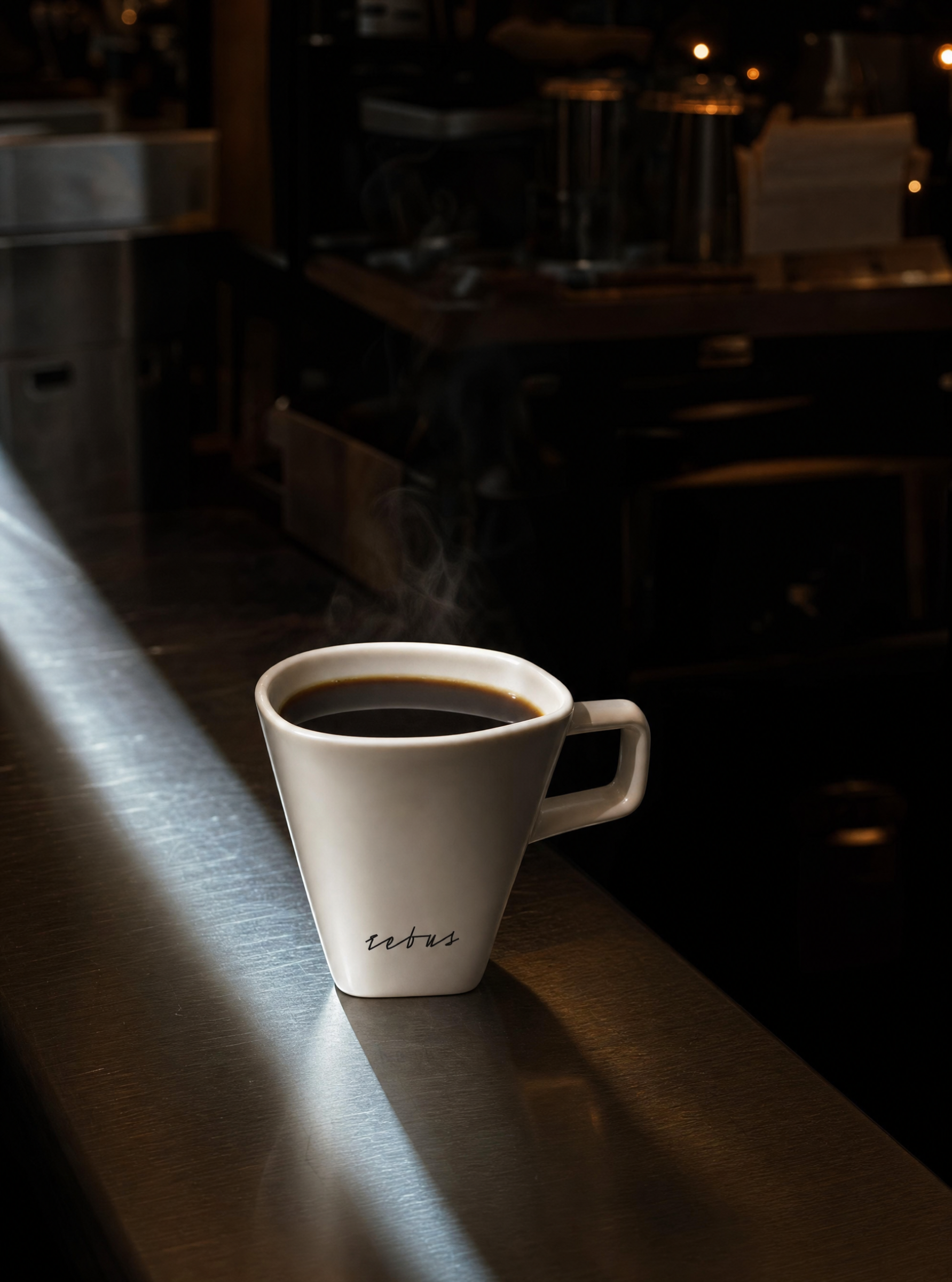
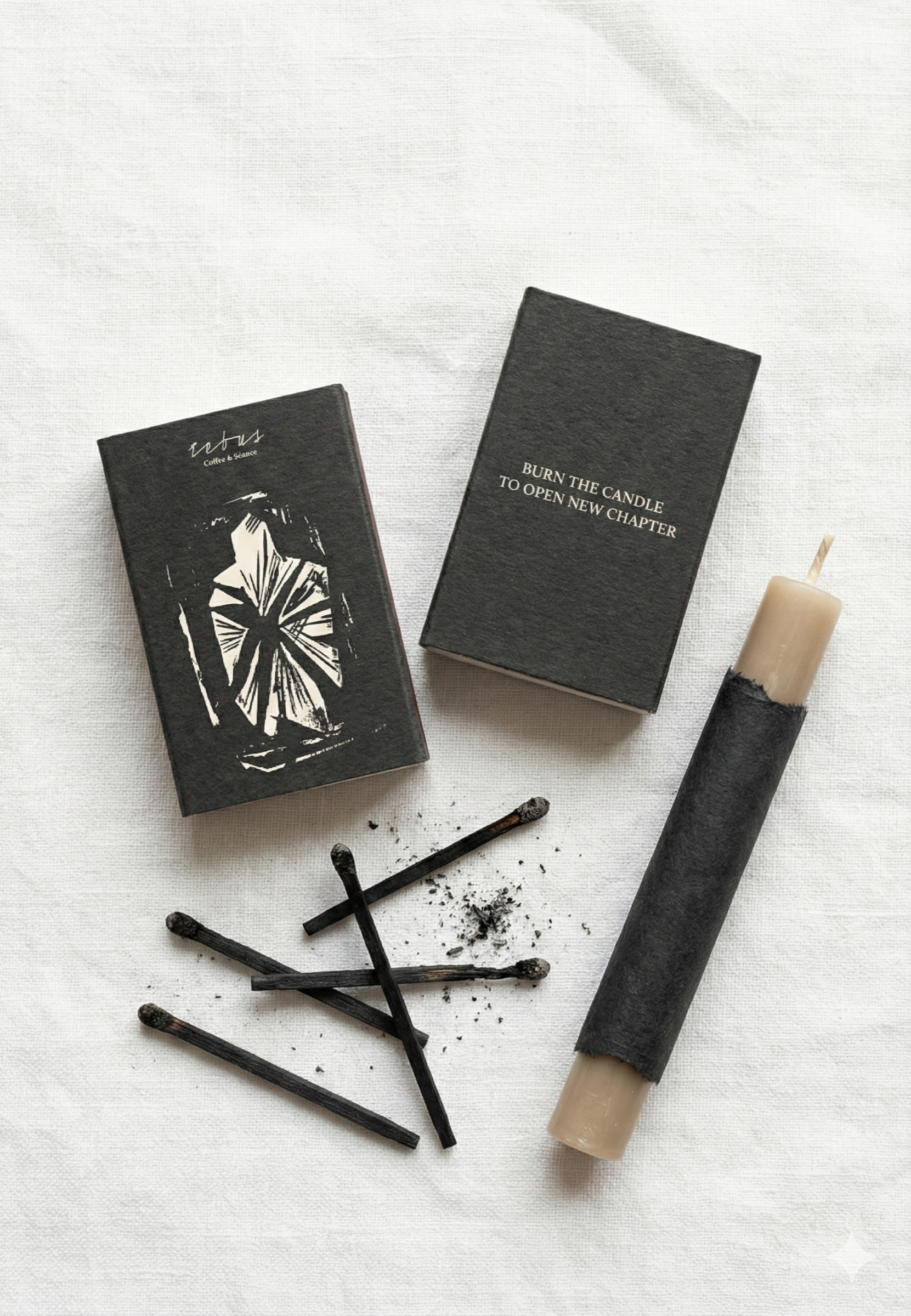
Branding for Rebus, a coffeehouse that reads as an ordinary café on the surface but operates as a real spiritualist place underneath — the identity had to carry that duality without giving it away outright.
Challenge
Rebus needed branding that could work as a normal, welcoming coffeeshop on the surface, while carrying an undercurrent of something more esoteric and exclusive — a "real spiritualist place" hiding underneath.
Solution
Process
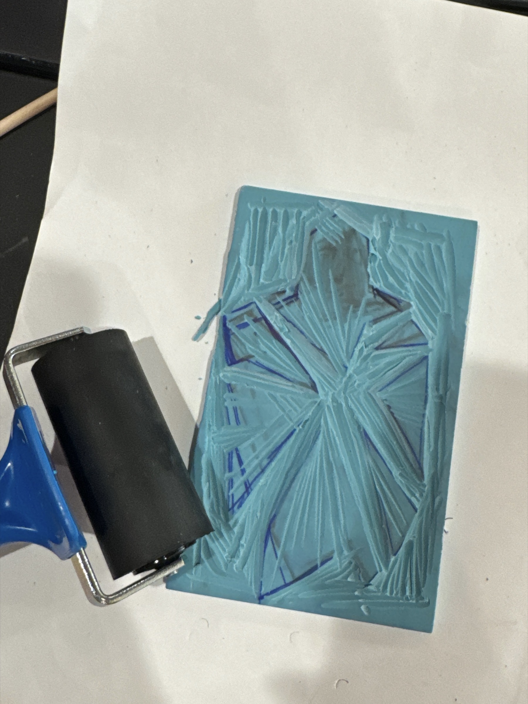
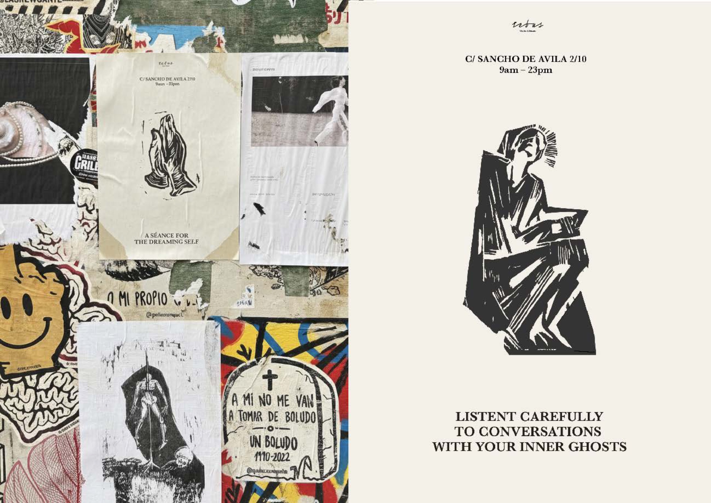
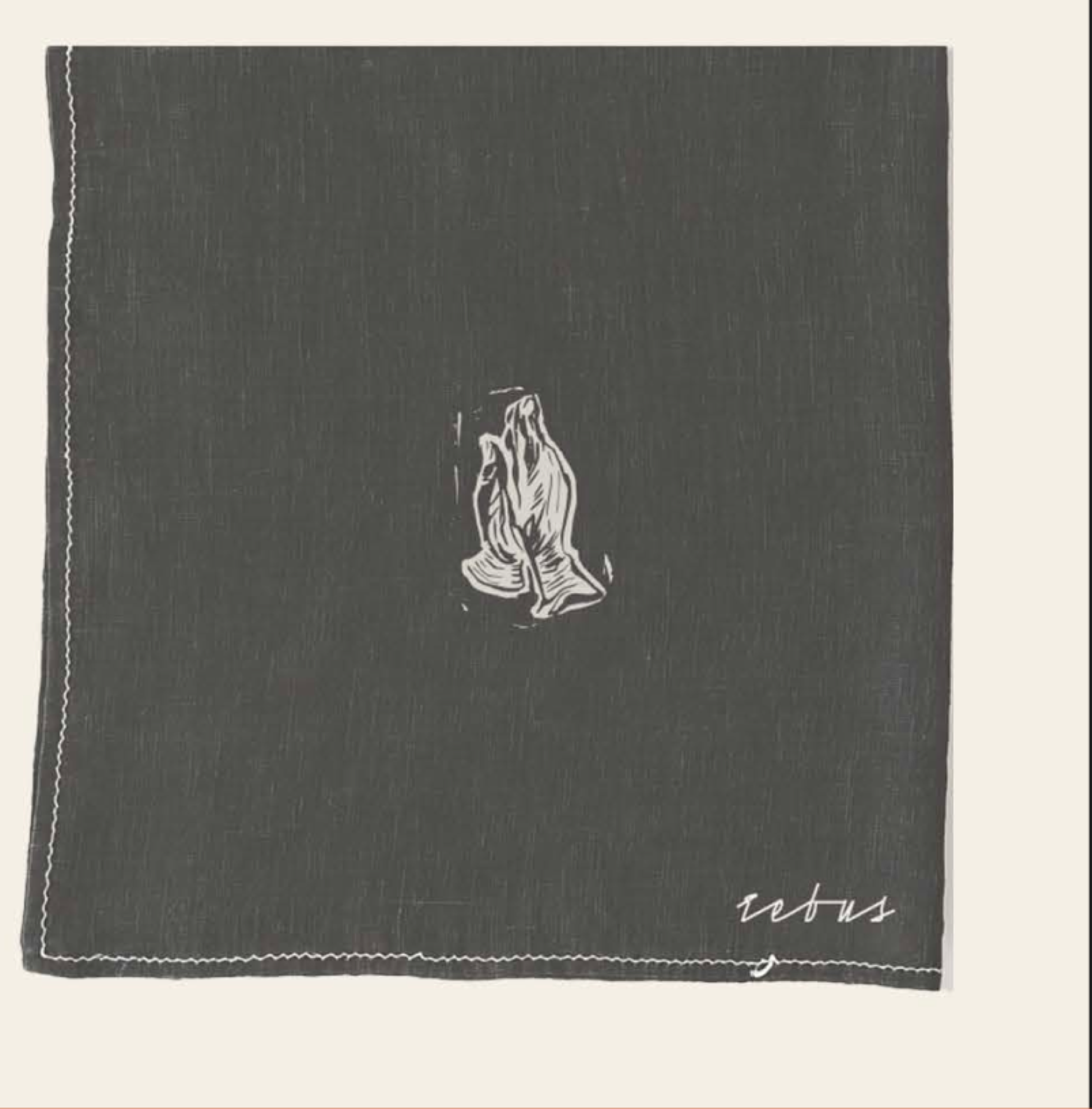
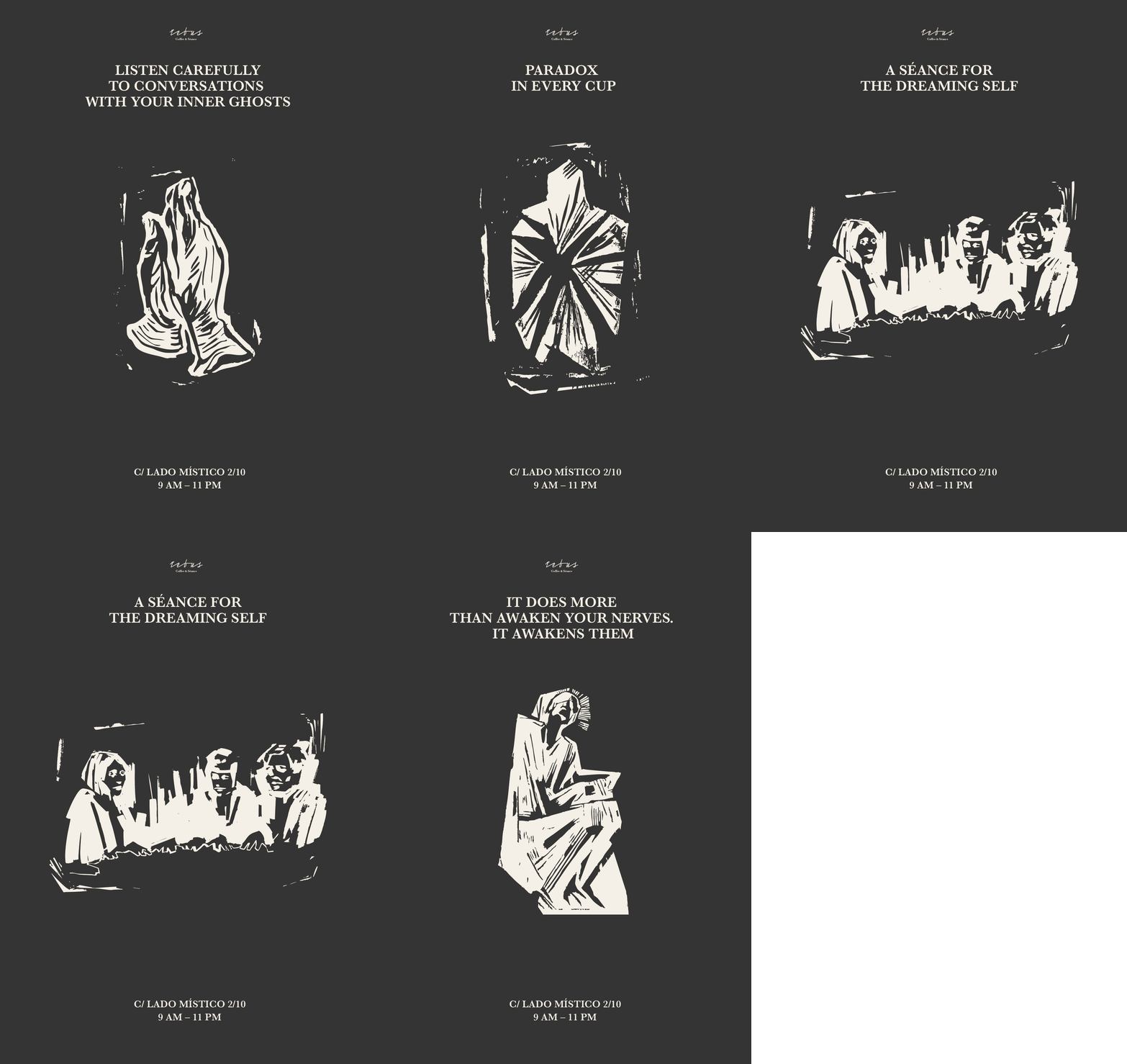
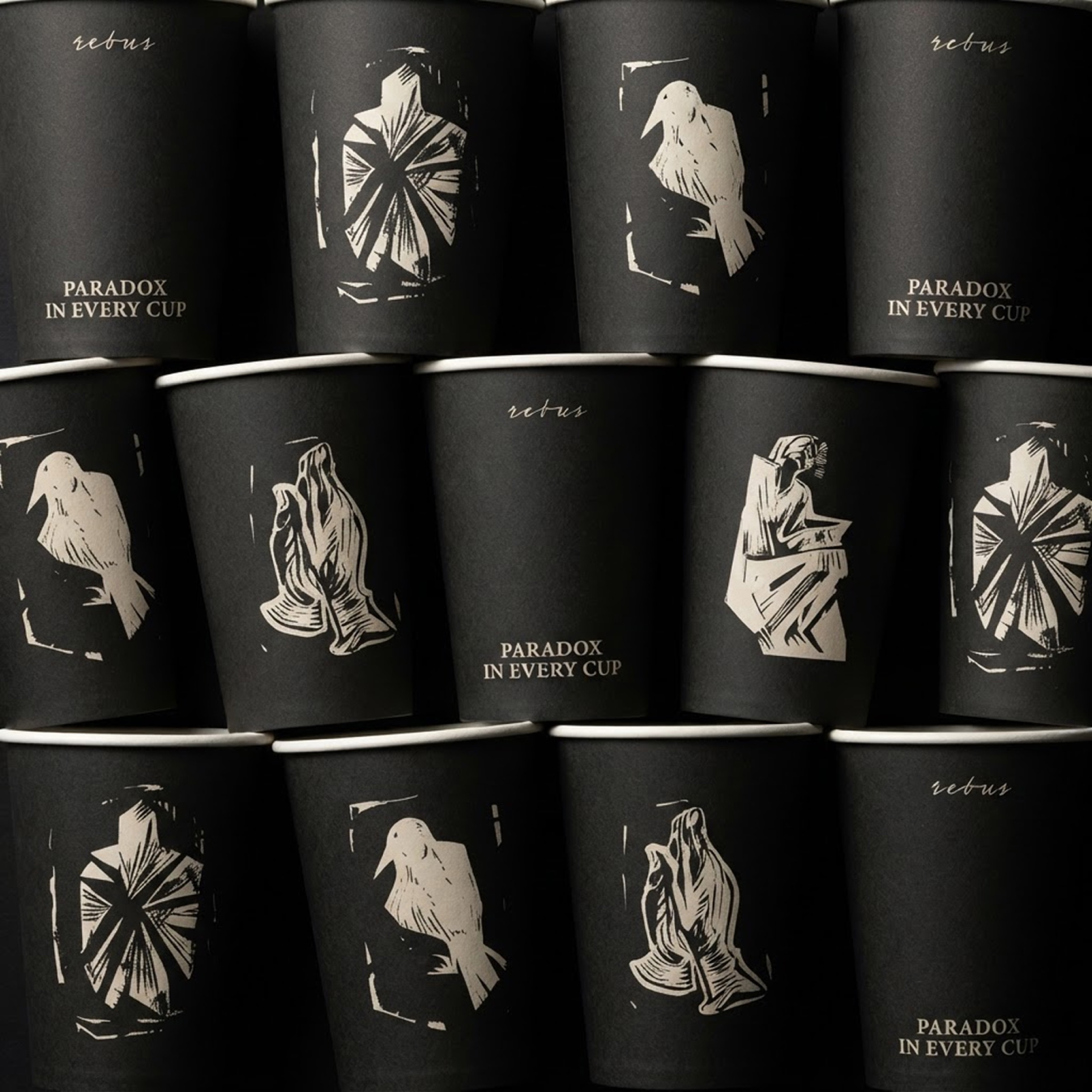
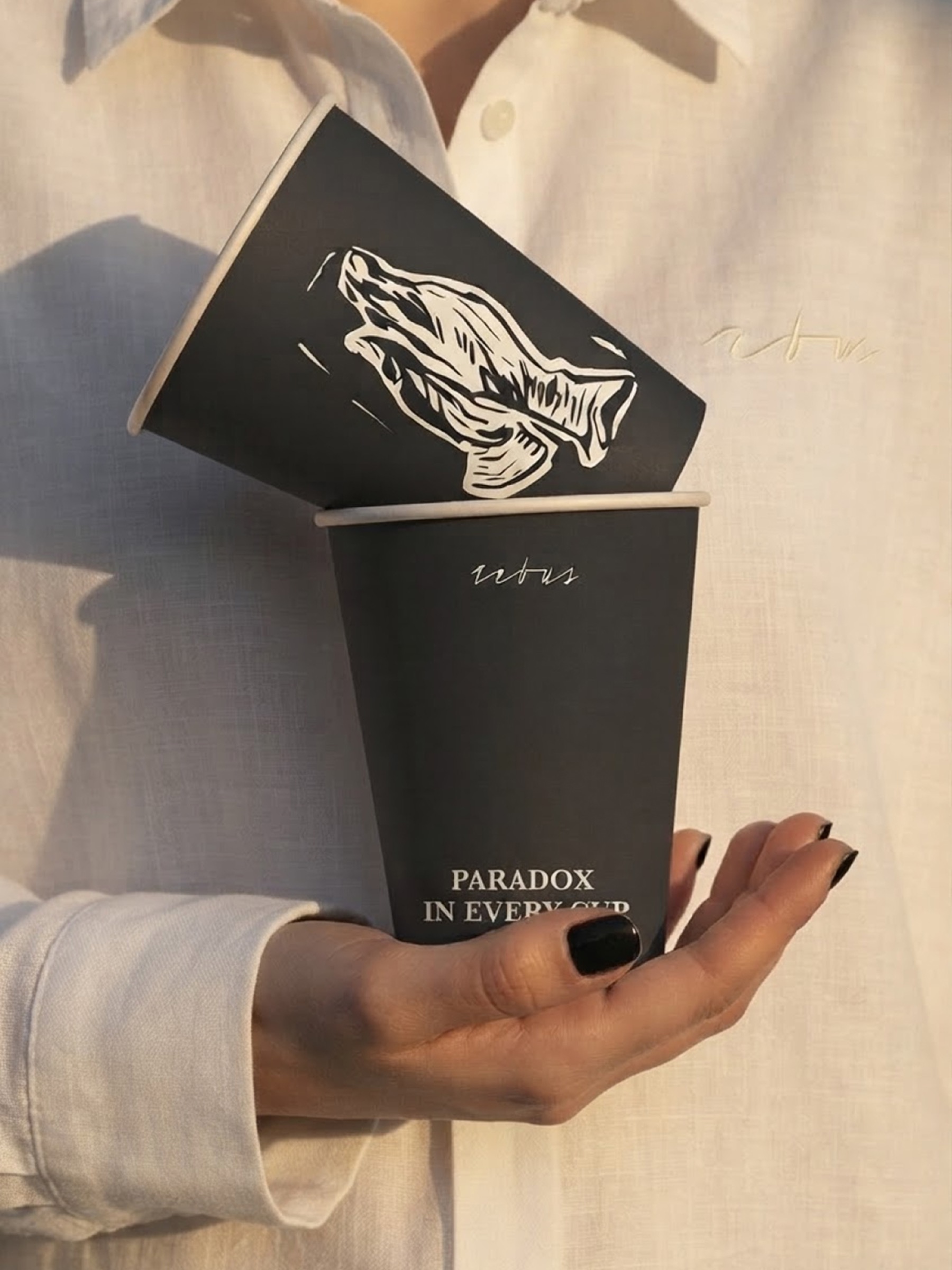
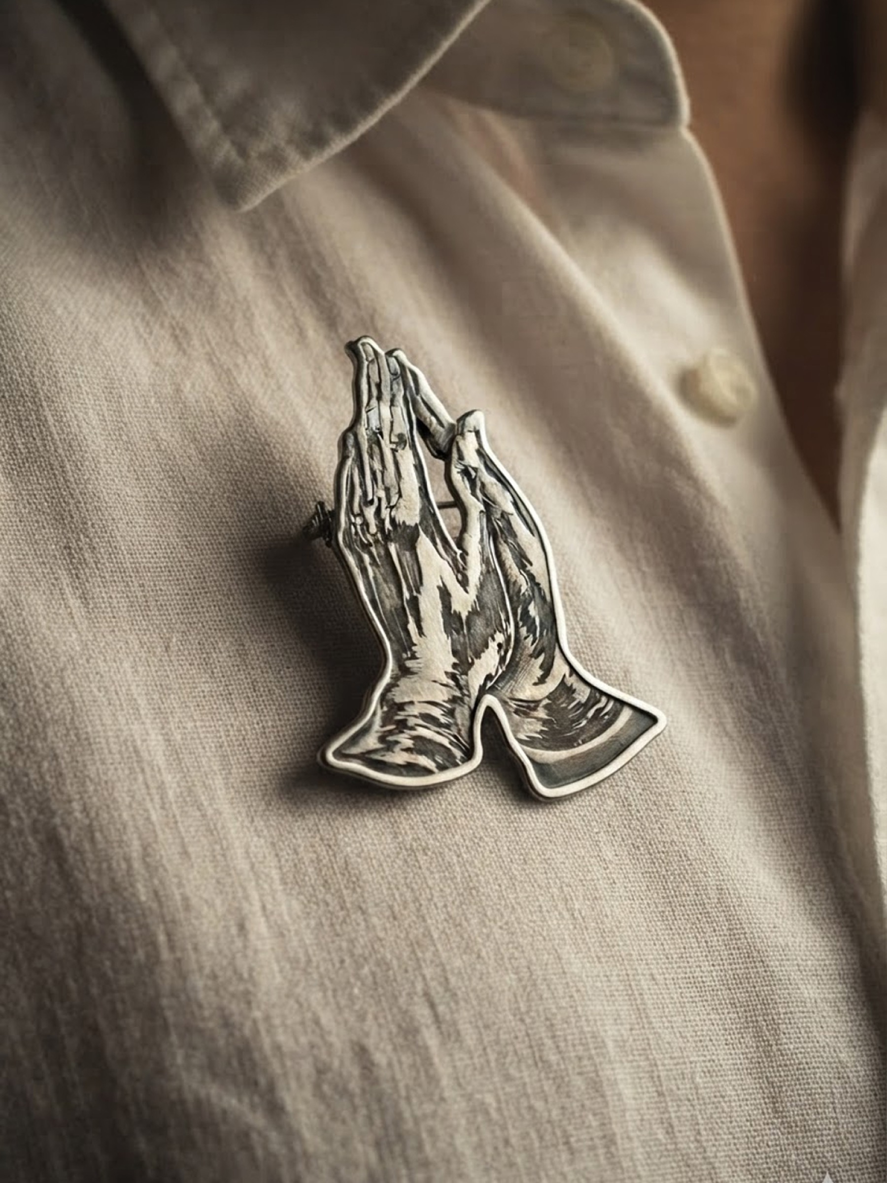
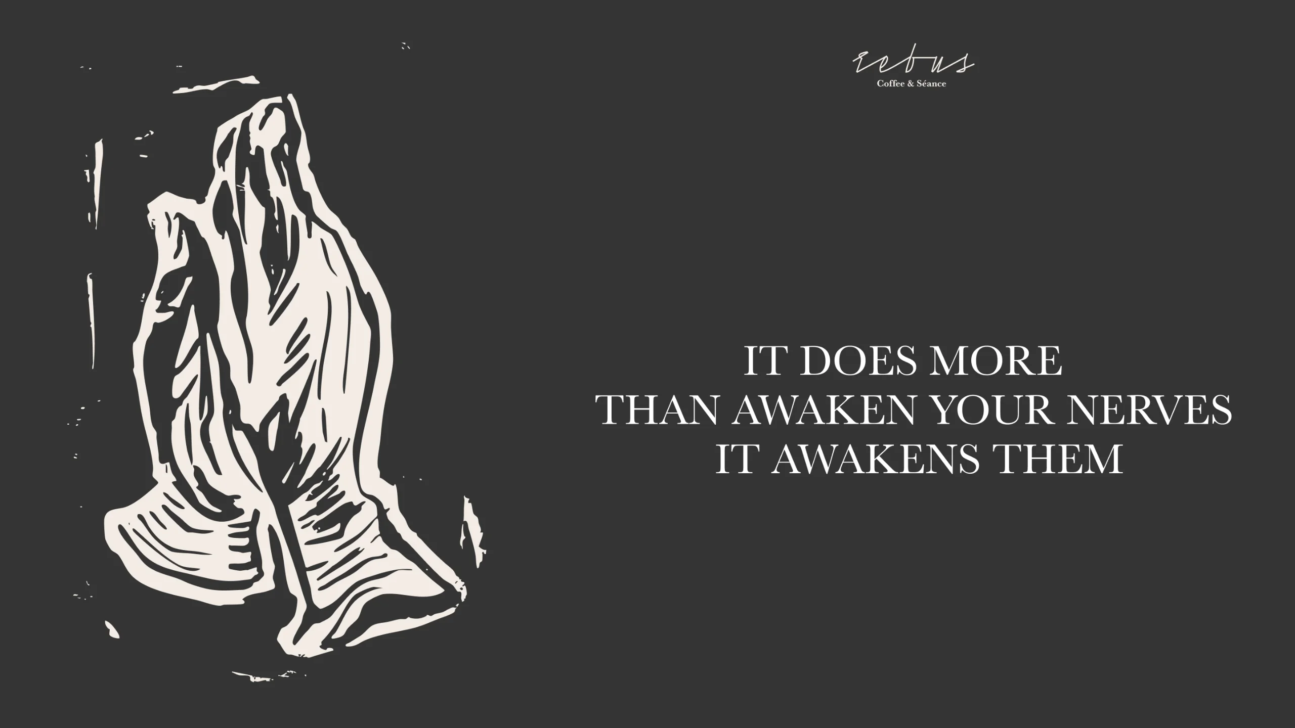
For the illustrations, I chose linocut — a printmaking technique where the image is physically carved out of a block, then rolled with ink and pressed. That process felt right for Rebus: the picture doesn't just get drawn, it gets dug out, cut away layer by layer until what's hidden underneath the surface is revealed. It's a fitting parallel to the brand itself — an ordinary coffeeshop on the outside, concealing something more conceptual and ritualistic underneath. The rough, imperfect edges linocut leaves behind also gave the identity a handmade, almost underground feel, distancing it from anything slick or corporate and pushing it closer to something secret, personal, and a little unpolished on purpose.
Result
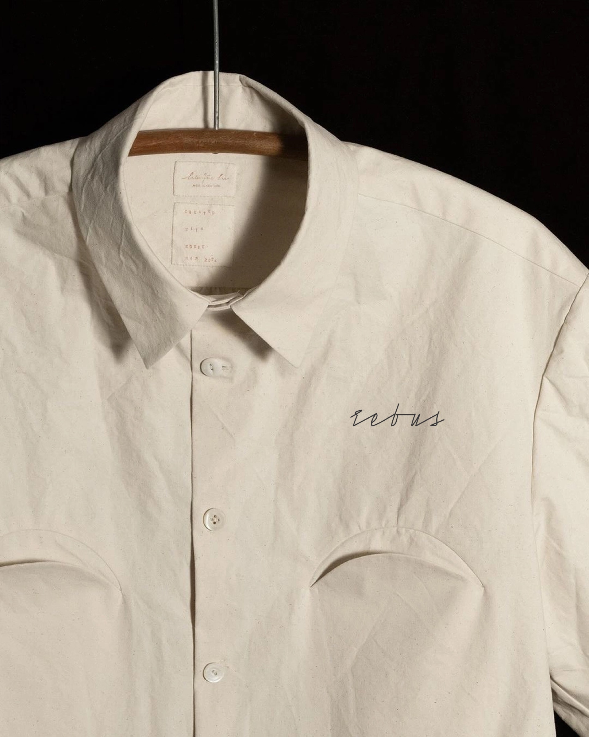
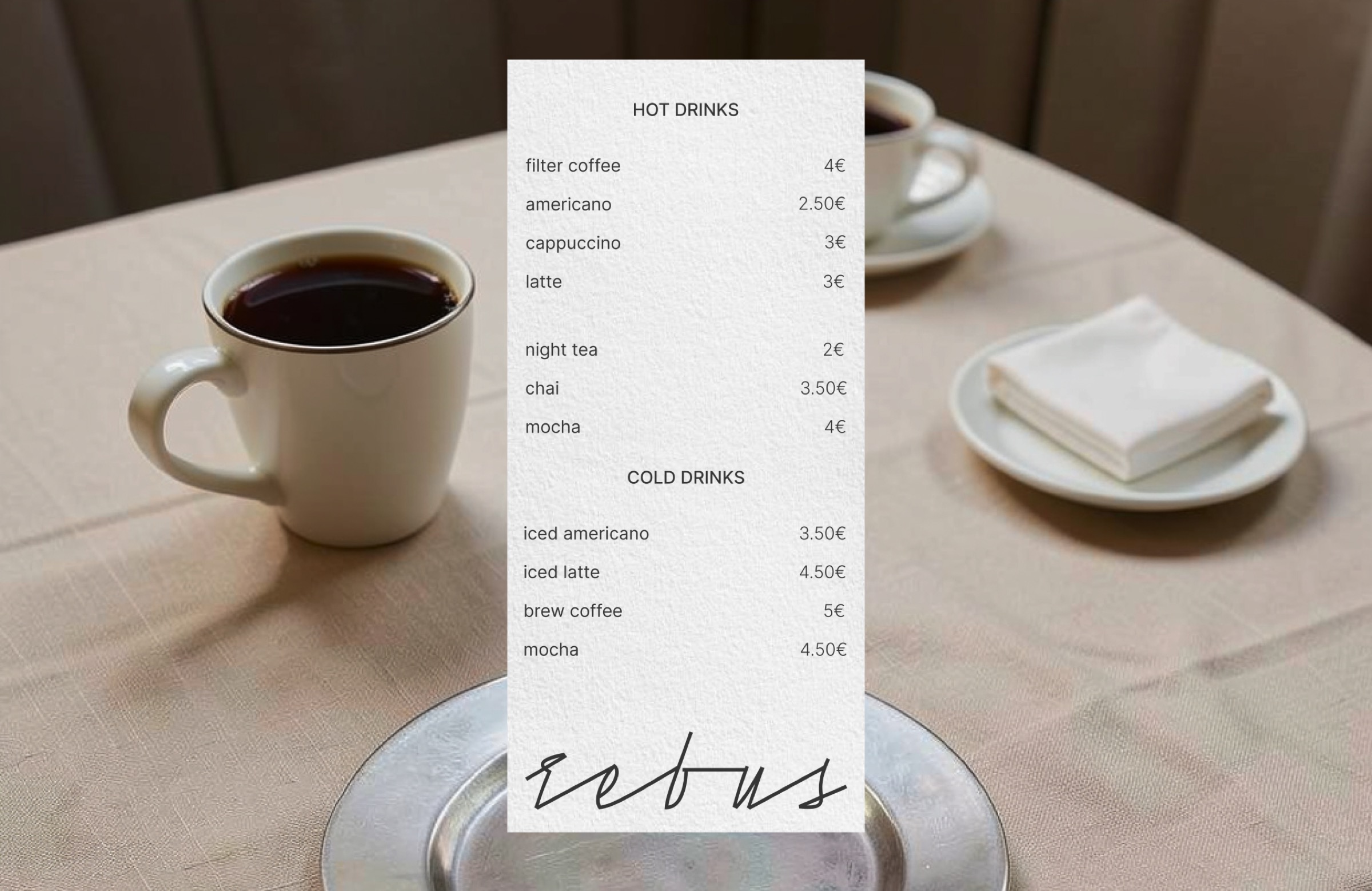
A visual identity that reads as approachable coffeeshop branding at a glance, while its linocut illustrations quietly hint at something more secretive going on beneath the surface.